How to Read a Bar Graph
Grade 6 Math Worksheets
Reading a bar graph involves interpreting the information presented in the graph to understand the relationship between different variables.
List of contents:
- Reading and Interpretation of Bar Graph
- Sample Example
- FAQs
Personalized Online Tutoring
How to Read a Bar Graph - Grade 6 Math Worksheet PDF
This is a free printable / downloadable PDF worksheet with practice problems and answers. You can also work on it online.
Sign up with your email ID to access this free worksheet.
"We really love eTutorWorld!"
"We really love etutorworld!. Anand S and Pooja are excellent math teachers and are quick to respond with requests to tutor on any math topic!" - Kieran Y (via TrustSpot.io)
"My daughter gets distracted easily"
"My daughter gets distracted very easily and Ms. Medini and other teachers were patient with her and redirected her back to the courses.
With the help of Etutorworld, my daughter has been now selected in the Gifted and Talented Program for the school district"
- Nivea Sharma (via TrustSpot.io)
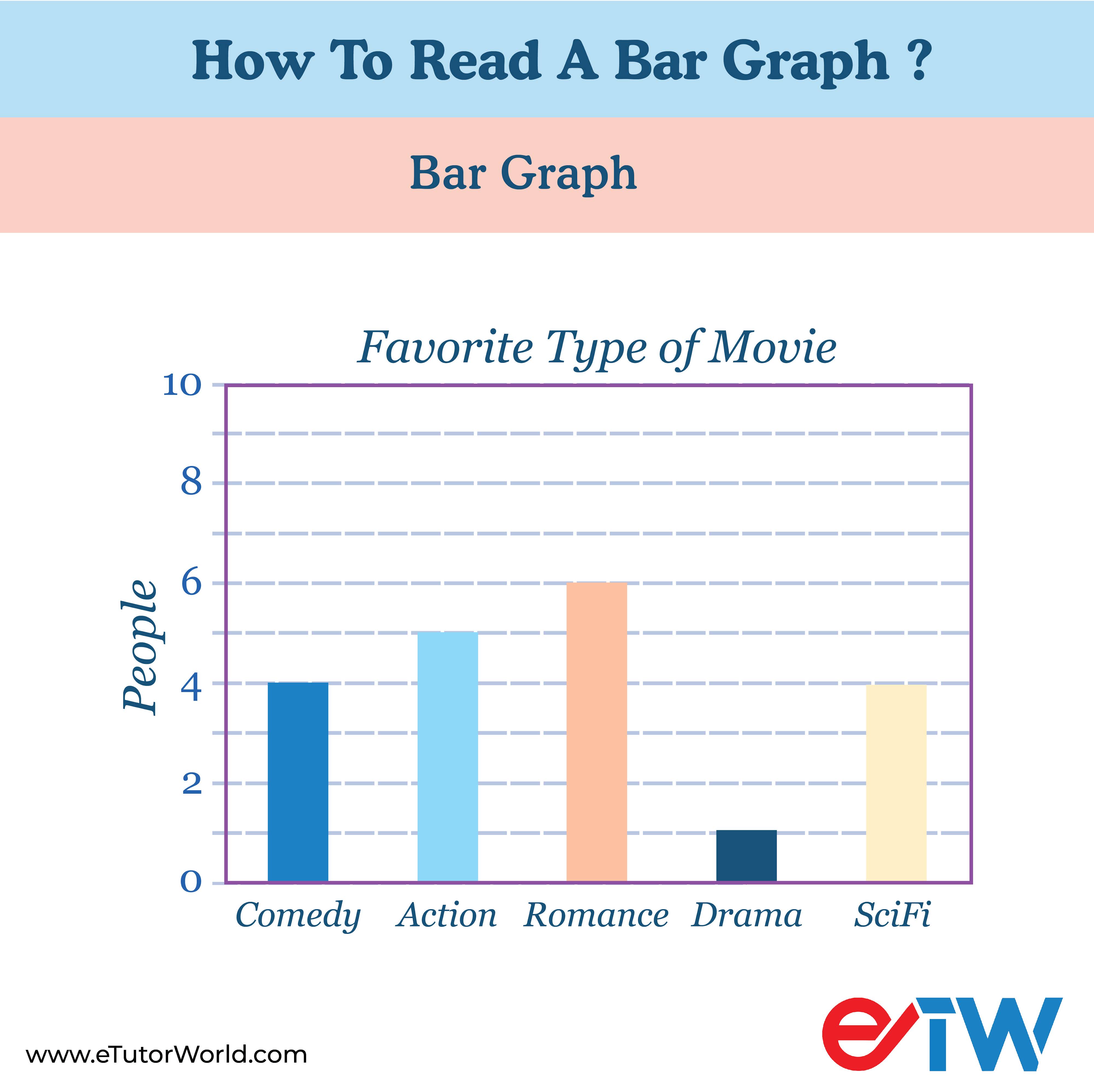
Reading and Interpretation of Bar Graph
Reading a bar graph involves interpreting the information presented in the graph to understand the relationship between different variables. Here are the steps to effectively read a bar graph:
1. Title and Labels: Start by looking at the title of the graph. It should give you an idea of what the graph is representing. Pay attention to the labels on both the x-axis (horizontal) and y-axis (vertical). These labels provide context for the data being shown.
2. Axes: Understand which variable is represented on the x-axis and which one is on the y-axis. The x-axis typically represents categories or groups, while the y-axis represents measured values or quantities.
3. Bars: Look at the bars in the graph. Each bar represents a category or group from the x-axis. The bar’s height or length represents the variable’s value or quantity on the y-axis for that specific category.
4. Scale: Check the scale of the y-axis. This scale determines the increments by which the values are measured. Note that omitting the zero point can lead to misinterpretation if the scale starts from zero.
5. Bar Length: Compare the lengths of the bars. Longer bars indicate higher values or quantities, while shorter bars indicate lower values.
6. Patterns and Trends: Look for patterns or trends in the data. Are the bars increasing or decreasing in a specific order? Are there any significant differences or similarities between the bars?
7. Comparisons: Compare the heights or lengths of different bars to conclude the relationships between the categories. Which categories have the highest and lowest values? Are there any notable variations?
8. Data Points: If specific values are indicated on the bars or axes, take note of them. These values can provide precise information about the quantities being represented.
9. Color and Labels: If the bars are color-coded, check if a legend explains the colors and what they represent. Also, if individual bars are labeled with values, labels, or percentages, make sure to read and understand them.
10. Context: Consider the context of the graph. Is there any additional information provided that helps you understand the significance of the data? It could include annotations, titles, or captions.
11. Interpretation: Interpret the information based on your observations and understanding of the graph. What conclusions can you draw from the data? Are there any insights or trends that the graph is revealing?
12. Double-check: Double-check your observations and interpretation to ensure accuracy before making any final conclusions.
Remember that reading a bar graph aims to understand the relationships between variables and extract meaningful information. Practice reading different types of bar graphs to improve your interpretation skills.
“There have been times when we booked them last minute, but the teachers have been extremely well-prepared and the help desk at etutorworld is very prompt.
Our kid is doing much better with a higher score.”
6th Grade Tutoring
eTutorWorld offers Personalized Online Tutoring for Math, Science, English, and Standardised Tests.
Our Tutoring Packs start at just under $22.49 per hour, and come with a moneyback guarantee.
Schedule a FREE Trial Session, and experience quality tutoring for yourself. (No credit card required.)
Sample Example
Sample Bar Graph: Average Monthly Rainfall
Let’s consider a bar graph that shows the average monthly rainfall for a particular city over a year.
The graph has two axes: the x-axis represents the months of the year, and the y-axis represents the amount of rainfall in millimeters (mm).
X-Axis (Months): January, February, March, April, May, June, July, August, September, October, November, December.
Y-Axis (Rainfall in mm): The scale starts from 0 and goes up in increments of 20 mm.
Now, let’s say the bars in the graph are as follows:
January: 40 mm
February: 45 mm
March: 60 mm
April: 75 mm
May: 110 mm
June: 150 mm
July: 180 mm
August: 170 mm
September: 130 mm
October: 90 mm
November: 50 mm
December: 35 mm
Interpretation:
Rainiest Month: From the graph, you can see that July has the highest bar, indicating that it’s the rainiest month with an average rainfall of 180 mm.
Driest Month: December has the lowest bar, showing that it’s the driest month with an average rainfall of 35 mm.
Seasonal Patterns: There is a trend of increasing rainfall from January to July, peaking in July. Then, the rainfall decreases gradually from August to December.
Transition Periods: Months like March and October represent transitional periods where the rainfall increases or decreases noticeably.
Comparison: You can easily compare the amount of rainfall between any two months by looking at the difference in bar heights.
Relative Rainfall: By looking at the bar heights in relation to each other, you can gauge the variations in rainfall across the months.
Do You Stack Up Against the Best?
If you have 30 minutes, try our free diagnostics test and assess your skills.
How to Read a Bar Graph FAQS
What is a bar graph?
A bar graph, also known as a bar chart, represents data using rectangular bars of different heights. Each bar typically represents a category or data point, and the height of the bar corresponds to the value it represents.
How do I read a bar graph?
To read a bar graph, follow these steps:
- Identify the categories or data points on the horizontal (x-axis) or vertical (y-axis) axis.
- Find the bars representing each category or data point.
- Determine the height of each bar, which corresponds to the value it represents.
- Compare the heights of the bars to understand relationships, trends, or differences in the data.
What is the purpose of a bar graph?
Bar graphs are used to display and compare data between different categories or data points. Patterns, trends, and variations in the data can be understood easily and visualized with this bar graph.
What types of data are suitable for bar graphs?
Bar graphs display categorical or discrete data, where the data points can be grouped into distinct categories. They are not typically used for continuous data, such as temperature readings.
Can I use a bar graph for time-based data?
Yes, you can use a bar graph for time-based data. In such cases, each bar represents a specific time period, and the height of the bar corresponds to a value or quantity for that time period. It is often referred to as a time-series bar graph.
What is the difference between a horizontal and vertical bar graph?
The difference lies in the orientation of the bars. In a vertical bar graph, the bars run vertically from the bottom to the top, while in a horizontal bar graph, the bars run horizontally from left to right. The choice between the two depends on the presentation style and data.

Gloria Mathew writes on math topics for K-12. A trained writer and communicator, she makes math accessible and understandable to students at all levels. Her ability to explain complex math concepts with easy to understand examples helps students master math. LinkedIn
Affordable Tutoring Now Starts at Just $22.49
eTutorWorld offers affordable one-on-one live tutoring over the web for Grades K-12. We are also a leading provider of Test Prep help for Standardized Tests (SCAT, CogAT, MAP, SSAT, SAT, ACT, ISEE, and AP).
What makes eTutorWorld stand apart are: flexibility in lesson scheduling, quality of hand-picked tutors, assignment of tutors based on academic counseling and diagnostic tests of each student, and our 100% money-back guarantee.


Whether you have never tried personalized online tutoring before or are looking for better tutors and flexibility at an affordable price point, schedule a FREE TRIAL Session with us today.
*There is no purchase obligation or credit card requirement
Grade 6 Science Worksheets
- Inquiry process
- Nature of Science
- Scientific Inquiry
- Inquiry, Analysis and Problem Solving
- Ethical Practices
- Science and Society
- Biotic and Abiotic Factors
- Impact of Organisms
- Adaptation
- Spheres of Earth
- Natural Resources
- Environmental Issues
- Conservation of Earth
- Understanding Technology
- Abilities To Do Technological Design
- Structure of Earth
- Solar System
- Rocks and Fossils
- Earth Systems
- Plate Tectonics
- Evolution
- Magnetic Field of Earth
- Geologic Time
- Materials and Processes That Shape a Planet
- Astronomy
- Ecology
- Energy
- Kinetic and Potential Energy
- Energy Transfer
- Matter and its Structure
- States of Matter
- Physical and Chemical Changes
- Force and Motion
- Electricity and Magnetism
- Wave Interactions
- Sound
- Light
- Introduction to Life Science
- The Origin & History of Life On Earth
- Plant and Animal Cells
- Parts of a Cell
- The Cell Cycle
- How Living Organisms Get Energy
- Classification of Organisms
- How Plants Grow & Reproduce
- The Human Respiratory System
- The Human Cardiovascular System
- The Human Digestive System
- The Human Endocrine Systems
- The Human Nervous System
- The Human Muscular System
- The Human Skeletal System
IN THE NEWS


Our mission is to provide high quality online tutoring services, using state of the art Internet technology, to school students worldwide.

Online test prep and practice
SCAT
SSAT
ISEE
PSAT
SAT
ACT
AP Exam
Science Tutoring
Physics Tutoring
Chemistry Tutoring
Biology Tutoring
Math Tutoring
Pre-Algebra Tutoring
Algebra Tutoring
Pre Calculus Tutoring
Calculus Tutoring
Geometry Tutoring
Trigonometry Tutoring
Statistics Tutoring
Quick links
Free Worksheets
Fact sheet
Sales Partner Opportunities
Parents
Passive Fundraising
Virtual Fundraising
Our Expert Tutors
Safe and Secure Tutoring
Interactive Online Tutoring
After School Tutoring
Elementary School Tutoring
Middle School Tutoring
High School Tutoring
Home Work Help
Math Tutors New York City
Press
©2022 eTutorWorld Terms of use Privacy Policy Site by Little Red Bird
©2022 eTutorWorld
Terms of use
Privacy Policy
Site by Little Red Bird